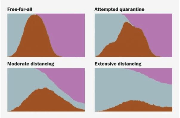
I’m a big fan of data visualization because mages can make complex things compelling. Few things are more complex than the wide-reaching implications of a pandemics like COVID-19. An article by Harry Stevens in The Washington Post includes a series of interactive graphics that demonstrate the power of contagion and why social distancing is so important in managing the current outbreak
The curves below makes it pretty clear why precautions will keep us from overtaxing medical resources so we can meet healthcare demands. I don’t know about you, but I don’t want a doctor having to decide whether me or the guy next to me gets the oxygen. I’m willing to say home to keep that from happening.
Why outbreaks like coronavirus spread exponentially, and how to “flatten the curve”
It’s hard, I know, to maintain the intensity of effort needed to guard against an unseen virus that is contagious even before symptoms show up and needs a minimum two-week quarantine to be safe from further exposure. It would be much easier if people who were contagious turned pink or had a yellow Twilight-Zone kind of glow. But they don’t. Coronavirus is invisible with a long incubation. This means we have to have a sustained effort at isolation, not just hiding out for a couple of days.
This is especially hard because people are, by nature, social beings. Human contact is essential to our mental and physical health. Cognitive biases also work against us–we inherently assume that others are more vulnerable than we are. As a species, we are notoriously bad at estimating probabilities. Remember, this isn’t about you personally. It’s about SPREAD. Use FaceTime and Zoom. Try to adopt a new risk profile by channeling #EddieIzzard: Cake or Death.
Instead of buying extra toilet paper, focus your energy and assuage your anxiety by a concerted effort to eliminate or minimize social contact. No playdate or birthday parties, no manicures, haircuts, or restaurant lunches, cut down on trips to the store, use delivery services, and recognize that just because you know someone well, you have no way of knowing where they might have been in contact with the virus. As you’ll see in the Post’s graphics, it spreads fast.
The article does a very good job job of explaining an agent-based contagion model. It demonstrates the speed of infection through a population–with and without barriers. Please share this with all your stubborn and/or selfish friends who don’t get the importance of everyone working together and avoiding social contact to slow the impact of COVID-19 on the United States as a system. This is the time to step up, stay home, and put individual convenience aside.
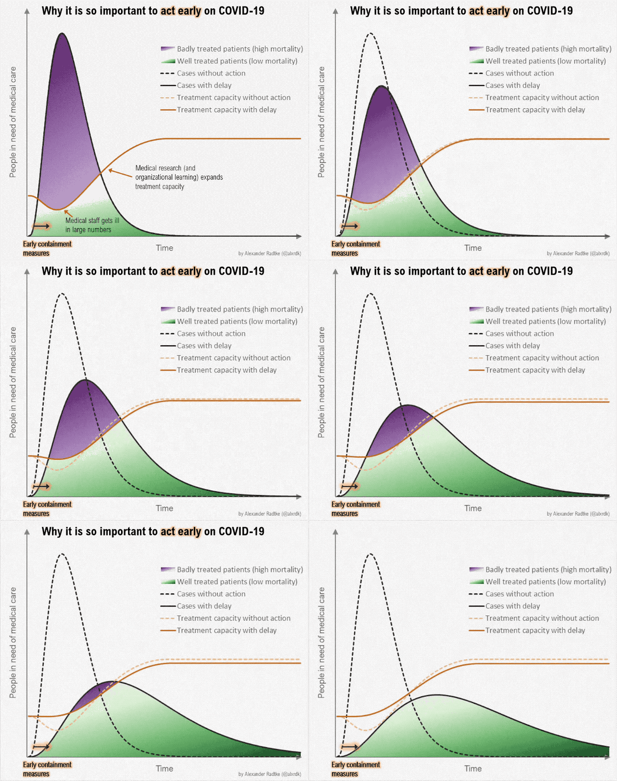
If the other graphics don’t convince you of the importance of treatment capacity, check this out:

Keep washing your hands and taking precautions, but keep reminding yourself that social distancing is the only way to slow the rate of spread and increase the ability of facilities to handle the needs of those who are hit hard.
Many thanks to The Washington Post for a great article & such compelling graphics.
Stevens, H. (2020, March 14). Why outbreaks like coronavirus spread exponentially, and how to “flatten the curve.” The Washington Post. Retrieved from https://www.washingtonpost.com/graphics/2020/world/corona-simulator/

 Dr. Pamela Rutledge is available to reporters for comments on the psychological and social impact of media and technology on individuals, society, organizations and brands.
Hi Pam! Great comments here and unless you object I will repost on LinkedIn. I hope you and yours are well and perhaps once that curve flattens we can figure out how to connect in person since we venture south pretty regularly. Virtual Abracos! Dana