- Throughout its history, Apple has sold identity, not products
- Message color has become a social categorization tool used to define “in” vs. “out.”
- Biologically and psychologically, people instinctively want to be “in.”
The Apple blue versus Android green messaging war isn’t about color. It is about membership and identity. All powerful brands rely on symbolic meaning drawing on universal and cultural archetypes that reflect social values. Some rule through success (Mercedes) or celebrate the hard-fought victories of warriors and heroes (Nike).
Apple is no different. They have built their brand as much on the symbolic meaning of their products as on the technology. The genius here is not the color of the messages but that Apple’s brand story shows at every turn and continually reminds us that they are different and special and, by extension, so are their customers. And like a not-so-secret handshake, when you text a friend, and it’s blue, they can tell you’re special too.
Drawing a Line in the Sand
Apple has been a master of using symbols, like color, to establish emotional connections with consumers and reinforce its brand story. Order a new Apple product, and the high-quality packaging tells you something important and special is in the box.
Starting with the iconic “1984” commercial, Apple has been drawing lines in the sand between them and everyone else. Apple doesn’t sell products. They sell the most human of things: membership in a community built on creativity and freedom–where authenticity and self-expression are empowered and celebrated. They humanized technology.
Whether intentional or not, Apple’s design decisions turned Apple computers into friends, from the Happy Mac icon to user-centric design. They were happy when you turned them on. Using them made sense to regular people thanks to the graphical user interface and the mouse. They were easy to use. They made you feel good.
When something is easy to use, we feel smarter. We get more done. We feel more productive. We are happier. Positive emotions have all kinds of benefits psychologically and physiologically for the user and the brand. Positive emotions shift the brand-consumer connection from one of utility to one that becomes integrated with identity, self-efficacy, and self-esteem.
Brand Archetypes and Belonging
Apple reinforces its archetype through voice, color, and values, not product attributes. Things like screen resolution are what our rational brains use to “rationalize” our decision to let our emotions loose and buy a new iPhone. Apple is an outlaw–breaking the bonds of social convention through originality, creativity, and nonconformity.
If it is clear what Apple’s brand is, it is also clear what it is not. It is not PCs. It doesn’t matter what company is the biggest competitor because whoever they are, they are not Apple. They are not part of the in-crowd–a group that’s so superior they don’t even have to be mean about it. They just need to remind people who’s “in” and who’s not.
Think about it. We don’t ask what kind of computer you use; we ask if you are a Mac person or a PC person with all the stereotypes that difference implies. Product affiliations become part of one’s social identity.
Why Blue and Green?
Apple could have used plenty of super-ugly colors (ochre comes to mind) or with worse contrast (red). However, the point is that the color identifies a non-Mac IOS, not that it’s ugly.
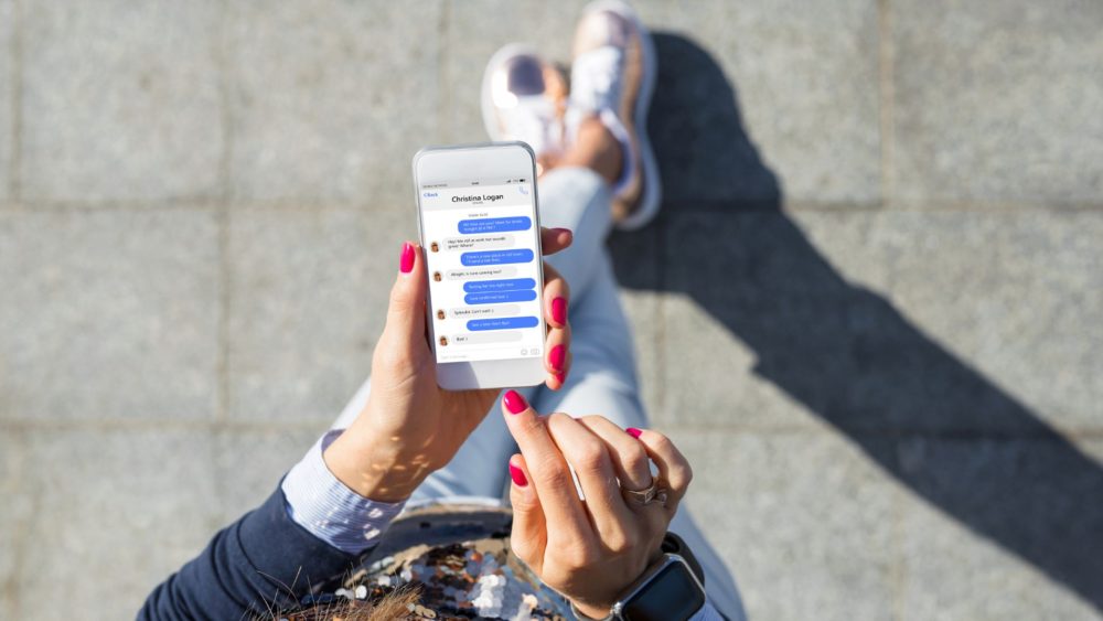
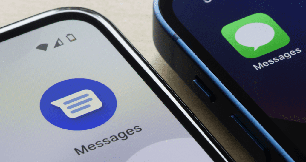
Android green is the same color intensity as Apple blue. Blue is more pleasing to read as it fights less with text, but that’s not the point. Message color has become a social categorization tool used to recognize and classify others. Apple’s strategy is not just to be distinct from all “those other guys” but to provide an elevated psychological experience that is subjectively “better” and exclusive.
Green (even lime green) has mostly positive connotations in color psychology. Green is associated with things like money, nature, prosperity, health, and “go.” In most contexts, green is a positive restful, and approachable color. For example, people are more likely to be happier and spend more time shopping in green stores.
However, Blue may have hidden benefits. It is mentally soothing, creating positive emotions that can increase creativity. Also, the text lacks physical cues, so a calmer person may be less likely to overreact when the meaning of a text is unclear, late, or short. But that’s just speculation.
It’s Not About the Color
The point is that the important thing about Apple blue and Android green is that they are different. It marks you as “in” or “out.” Biologically and psychologically, people instinctively want to be “in.” There are probably people reveling in their greenness in protest to Apple’s blue. However, social media is full of the blue-green debate, aided by Google’s #getthemessage attempt to shame Apple to change. Good luck with that. Apple must be very pleased with all the people who don’t want friends with green messages. Talk about social influence.


 Dr. Pamela Rutledge is available to reporters for comments on the psychological and social impact of media and technology on individuals, society, organizations and brands.