 The Application of Theory to Web Design
KEY POINTS
- Psychology’s value-add
- Assess audience needs
- Developmental abilities of audience
- Cognitive understanding of attention and information processing
- Cognitive and emotional impact of color
- Social influence of images
- Cultural context for meaning
- Elements contributing to engagement and self-efficacy
- Perception is subjective experience
- User’s attention will be driven by his/her own needs
- Design must be user-driven
In the four years from 2005 to 2019, social media usage when from 5% of households to 80%; compare that to the adoption of electricity which took 32 years from 1908 to 1940 to reach the same level of adoption[1]. No longer the new frontier, the internet is an essential tool for commerce, education (formal and informal), entertainment and social connection. Websites in their many guises are used for everything, in some cases causing huge disruptions in ‘business as usual.’ A web presence is not just a key marketing tool, it is the front door. The web experience defines and validates a brand, creates direct personal connections to customers and communicates tone, values and personality. A web presence’s success will not be judged by its beauty or technological tricks, but by how well the site communicates that it can meet the needs of a user.
To make a website a powerful and effective form of communication requires using psychological principles as the foundation to design. Psychologists and cognitive scientist work in many capacities on web-based systems, bringing a wide range of expertise that can facilitate an array of applications. From e-commerce to education and business to healthcare, psychology addresses the fundamental problems in web design: attracting the user, facilitating their experience, and satisfying their goals.
This section takes a practical approach to the topics of attention and color discussed in Parts I and II by applying theory to enhance the functionality of a website design.
Visual Attention
Microsoft scientists Czerwinski and Larson (2003) argue that there is a need for more research incorporating cognitive principles in real-life web applications. In their experience, designers often start with cognitive principles, but quickly find that they problems they face are beyond available frameworks. Because requirements in designing websites today are so complex, they feel that cognitive science research has not even “scratched the surface” (Czerwinski & Larson, 2003p. 4). One area, however, that draws directly on cognitive theory is in the domain of visual attention. This field has identified many of the factors that capture attention, both involuntarily and automatically. Since a website is essentially a visual medium, this knowledge can be put to use to visually engage the viewer and facilitate information access.
Covert Attention
Processing begins before you consciously attend (Logan, 1992). With preattentive processes providing the informational basis for attentional selection, a viewer is aware of a website’s contents before conscious processing begins. Many consider preattentive processes to be automatic (Duncan & Humphreys, 1992; i.e. LaBerge & Samuels, 1974: in Logan, 1992; Posner, 1997) because they are fast and effortless and take place while the subject is engaged in another task. Attentional selection only occurs when preattentive computations are complete. McCormick (1997, in Ivanoff & Klein, 2003) concluded that peripheral cues that appeared below the threshold of awareness could attract attention because they facilitated target processing, a sort-of preattentive priming.
Primary visual features, such as color, orientation, and intensity, as well as basic Gestalt principles of organization, are processed preattentively create a saliency map for direct conscious attention (Posner, 1997; Treisman, 1998). Preattention information processing, therefore, will take in color-coded organization and spatially related content automatically, aiding intentional navigation and speeding up information retrieval and processing. In initial contact, time is of the essence. According to the CCI, people make a subconscious judgment about something within 90 seconds of initial viewing and between 62% and 90% of that assessment is based on color alone (CCICOLOR – Institute for Color Research). See Theories of Attention
Overt Attention
Once a viewer has arrived at a site, the goal shifts to attention engagement. Capturing attention will depend on a number of factors, both top-down (intentional seeking by the viewer) and bottom-up (sensory input).
Predictability and unpredictability both contribute to holding the attention of a viewer. Predictability can enhance navigation and provides an expectation framework for focusing on information from one page to the next. As illustrated in the Gap.com sites, the navigational menus and product placement remains in the same location for all of their clothing departments. This predictability allows viewers to build a cognitive map of the site which facilitates ease of navigation and increases the likelihood of purchases.
 Attention can be directed by unpredictability as well. According to studies by Horstman (2005), the unexpected appearance of color increases attentional capture. Bartram, Ware, & Calvert (2003) found that icons with simple motions are very effective coding techniques for notification; often better detected and identified than color and shape codes when placed on the periphery of the field of vision. These studies and other suggest that change is a tool that can be used in many modalities on a website to attract attention. Change can be generated altering size, placement, and texture, as well as integrating of movement sequences (i.e. elements such as flash graphics), banners, and audio and video files (Ivanoff & Klein, 2003). A notable exception to this, of course, is when change, such as pop-ups, is too frequent and distracting and becomes an annoyance, thereby detracting from the goodwill the viewer holds for the site, the products, and the company.
Color is an obvious choice to deliberately to attract attention. Color can create movement when values jump quickly from in brightness, value or hue, or by the juxtaposition of strong complementary colors.
A single bright color amidst muted tones pulls visual attention to the element, e.g. the startling blue eyes on a monochromatic photo draw visual attention to the model’s eyes in a mascara ad on Lancome.com. Grouping items by color causes them to be perceived as a group and separates them from other elements, increasing both attention and legibility.
 Content/Relevance
Viewers scan visual fields for focal points, selectively searching for information related to their goals (Evans, 1990; Jones & Yee, 1993). They rely on predictable elements, headers, titles, and a dominant location for finding important information in order to skim, scan and predict the content and its usefulness. It is important to consider design relative to the needs of intended viewers; all users have needs and goals that can be targeted. Maslow’s needs hierarchy is one approach to thinking about prospective viewers. Examples of user needs in this framework might be: learning (cognitive needs), finding help or fulfillment (self-actualization needs), or buying the latest fashions (belongingness needs or esteem needs) (Huit, 2004)
Controlling the Visual Path
Every aspect of the site, such as fonts, color, organization, sound, motion, layout, imagery, and content, will play in role in controlling the user’s eyes if implemented properly. The organization structure enhances the way a message is decoded and processed so that the user can more quickly be oriented and find desired information. Assigning colors to distinct areas can aid in the orientation and provide spatial coherence Evans (1990).
The difference in color or font between regular links and visited links gives readers context, reminders and navigation tools (Jiang & Song, 2005). Dumais, Cuttrell and Chen (2001) report that because short-term memory doesn’t seem to be a factor in picking web links, it is important to give people the information they need with good labeling to aid their navigation and orientation on the site (Dumais et al., 2001). They also suggest that good visual categorization, spatial grouping and labeling of web content are critical to optimizing presentation of navigable search results.
Research has isolated common scanning patterns with which users scan a web page. Users rarely read web pages word by word; instead, they scan the page, picking out individual words and sentences. Web pages have to employ scannable text, using pattern recognition models for maximum input at minimum cognitive load. In a recent study John Morkes and Jakob Nielsen found that 79% of the users in their test group scanned, compared with 16% that actually read the text. In eye tracking studies, the dominant reading pattern was an approximate “F” shape in three movements: first pass: users scanned horizontally across the upper part of the content, second pass: just below the first pass, horizontally across half the page; third pass: vertical movement down content’s the left side.
There are cultural differences in eye-scan patterns. In English-speaking cultures, a horizontal-vertical orientation follows the expected reading path. There is a natural tendency for visual scans to follow horizontal or vertical lines. Diagonal lines do not receive the same amount of attention (Nielsen & Loranger, 2006). Recent research results by Lau, Goonetilleke, and Shih (2001) reported different patterns for Chinese readers, with additional variation among Mainland Chinese and Hong Kong Chinese, with the Hong Kong Chinese using a more systematic horizontal search pattern and Mainland Chinese adapting their search pattern depending on the screen layout.
The Gestalt principles
Gestalt principles of visual perception offer powerful approach to organizing and distinguishing content and directing attention both covertly and overtly (van Duyne et al., 2003). Carefully arranged content can be highlighted using the contrast between the foreground and the background to make boundaries visually strong. This allows the eye to differentiate among content sections, headings, and navigation automatically. Contrast can be applied to sections or to words and can be achieved with color as well as black and white.The illustrations show the value of recognizing Gestalt principles. Here figure/ground principle is illustrated, showing the contrast in legibility with different degrees of contrast. Patterned background adds visual noise, reduces clarity, and detracts from the figure-ground contrast.

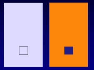
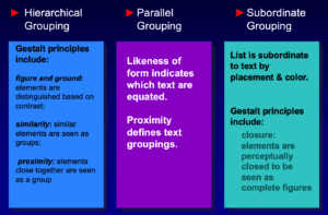
 Using the principle of proximity creates the sense of a relationship among objects, directing the eye through appropriate groupings. This type of strong visual organization will engage pre-attention cognitions and facilitate the speed of cognitive processing (Jiang & Song, 2005)
Function Over Form
Typography
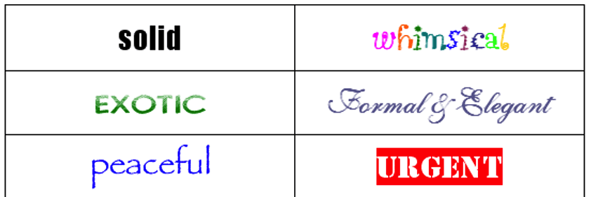
The use of typography is fundamental in achieving good readability and but it is overlooked as a means of portraying mood and meaning. Brumberger (2003) investigated the impact of typeface styles on readers’ perception of text meaning. Resulted supported her hypothesis that perceptions of the appropriateness of a typeface interacts with other cognitive processes, such as reading comprehension and speed. It also affected readers’ perceptions of a writer’s ethics and credibility. Schriver (1997) argues that type plays in communicating purpose and organization as well as mood, personality, and tone. This emphasizes the importance putting these aspects to work in support of the website’s goals and purpose.
The Stroop test is an empirical method used in psychology to verify the cognitive interference of implicit meaning with explicit meaning. Researchers found that it is virtually impossible to look at a familiar word and not read it. The Stroop test requires subjects to name the ink color of a word, not the word itself. Subjects are much slower at naming the ink color if the word is the name of another color and they frequently make errors with the name of the written word overriding the color of the text (Anderson, 1995).
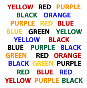 In addition to the typeface, the alignment, size, and style of text also impact reading and processing speed. Research results report that text set in a flush left paragraph form is easiest to read, with justified text taking 10% to process (Trollip and Sales, 1986, in Hill & Scharff, 1997). Other studies confirmed that upper-and-lower-case text was much faster and easier to read than text all in capital letters. Part of the speed of reading comes from recognizing spatial shapes as cues; text in all capitals takes away the shapes of the words. Choices of type style, such as italics or boldface, and typeface, such as Arial or Times Roman, also impact readability. Studies have shown that serif fonts are easier to read than sans serif. This has been shown to be true even with fixed width fonts, comparing Courier (serif, fixed width) to Arial (sans serif, proportional.) However, on pixel based displays, the opposite is true because sans serif fonts are simpler and translate better at lower resolutions. Not surprisingly, the research results by Hill & Scharff (1997) looking at the variables of typeface, typestyle, and color combinations, suggested that all these factors interact with one another. Thus, designers must consider each element’s in the context of the whole.
Visual Noise
Because space on a website is visually constrained, there is a trade off between information and clutter. The impact of clutter on performance has the greatest impact on visual search but may also be reflected when target items are difficult to interpret because of spatial placement. The more cluttered a visual field, the more time that will be required until the target item is found (Schneider & Shriffrin, 1977). Google.com remains an example where information and clutter is minimized so the user can immediately find and use the site’s service.
Color
Humans can see over 2 million colors. Because not all are pleasing, so understanding the effects of color is critical to make color choices that contribute rather than detract from the purpose of the site. Color can function in several capacities. Central to educational sites, it enhances memory and facilitates the processing and storage of images more efficiently than achromatic scenes and influences mood and cognitive processing ability (Soldat & Sinclair, 2001; Wichmann et al., 2002). In e-commerce, color influences mood and effects the possibility of product purchase (Bellizzi & Hite, 1992). Media containing colors with high levels of brightness lead to a sense of greater liking for the site and products. High saturation creates greater feelings of excitement and also increases likeability (Gorn et al., 1997). Color also gives signals about target audiences, such as age and gender (Khouw, 1999; Lazreg & Mullet, 2001)
Technology
If it weren’t for technology, there would be no websites. At the same time, computer and web technologies have requirements and constraints that are different from other forms of media.
Web audiences are all ages and levels of sophistication, so comfort with technology and the ability to understand and interact with the site are key consideration in design. Kruk and Muter 1984 found that text displayed on video monitors is 20-30% slower to read than printed text (where reading speed was the proxy for legibility.) There is also some indication that close contrast between colors at the opposite ends of the spectrum with different wavelengths can cause eye fatigue due to different focal lengths (Hill & Scharff, 1997). These kinds of studies bring attention to the need to incorporate a target audience’s perceptual and cognitive abilities, as well as hardware access and familiarly, particularly age-related. Note the differences in treatment between AARP.com and MTV.com (Figure 21). The AARP targets an audience of 50 years and over. The background color is white, the text black for best possible contrast. The information is in one column, with space between each sentence to enhance legibility and give a quick indication that the material to be read is not heavy and dense, but easily managed. The only area highlighted for attention is the logo, predictably placed and easy to find in the upper left hand corner and the “Join AARP” link in bright orange to the right. The site projects an image of safety, simplicity, and caring. The primary message is on what AARP can do for its members. In contrast, MTV.com is targeting a young, primarily preteen to twenty-something audience. The site is constantly full of movement. The news logo at the top of the center column spins continuously, images and text in five of the nine copy blocks changes with varying types of fades at different intervals between 2 and 10 seconds. The images of people are shot up close for maximum emotional engagement. The text is small and the color scheme provides less contrast. MTV.com projects an image of energy and trendiness. The emphasis is on what you see, stimulation, not reading or learning. The site offers both entertainment and the illusion that you are part of this hip celebrity idol crowd.
Technology also impacts the application of color. Different computer systems handle color differently in two ways: the number of colors and the brightness of colors (Niederst, 2001). Numbers of color on the web can be constrained by a viewer’s monitor. The color brightness is affected by the monitor’s gamma settings.
Conclusion
Attracting attention is a high priority for a website. Perception, however, is a subjective experience and a viewer’s attention will be driven his/her own needs, expectations, and behavioral patterns. Attention models can provide keys to understanding the way people perceive and process information and increase the probability of creating a successful and effective site. They suggest a broad range of approaches to put theory into practice.
Websites are primarily a visual medium. The elements on the page convey information to the viewer; they present a visual metaphor using the language of color, typography, balance, rhythm, proportion, dominance and unity. Different combinations of placement, colors, type, and objects density change the tone. Like all communication technologies, to be effective they must be designed with the user in mind. There will always be new technology, but the critical focus is on the user. Effective designers of all media understand and support people’s cognitive, emotional, and physical abilities. It is important to organize the material for effective communication, guide the reader’s eye through the page, and create an exciting visual experience in keeping with the goals of the site. Psychology as a discipline is uniquely situated to provide the tools to assess audience needs, a cognitive understanding of attention and information processing, the emotional of color, and the social influences of images. Psychology provides a full toolbox of concepts and skills that enhance functionality and desirability—keys to a successful website.
References
Albers, J. (1971). Interaction of Color. Yale University Press.
Anderson, J. R. (1995). Cognitive Psychology and Its Implications. W. H. Freeman and Company.
Anderson, J. R., Bothell, D., Byrne, M., & Lebiere, C. (2002). The Information Bottleneck: Theory and Applications. Psychological Review. Retrieved May 15 from http://www.andrew.cmu.edu/course/85-412/readings/INTEGRATED.NEW.2002=FINAL.pdf
Anderson, J. R., Matessa, M., & Lebiere, C. (1997). ACT-R: A Theory of Higher Level Cognition and Its Relations to Visual Attention. Human-Computer Interaction, 12, 439-462.
Ashcraft, M. H. (2002). Cognition. Prentice-Hall Inc.
Bargh, J. A. (1996). Automaticity in Social Psychology. In E. T. Higgins & A. W. Kruglanski (Eds.), Social Psychology: Handbook of Basic Principles (pp. 169-183). The Guilford Press.
Bartram, L., Ware, C., & Calvert, T. (2003). Moticons: Detection, Distraction, and Task. International Journal of Human-Computer Studies, 58(5), 515-545.
Bellizzi, J. A., & Hite, R. E. (1992). Environmental Color, Consumer Feelings, and Purchase Likelihood. Psychology & Marketing, 9(5), 347. Retrieved May 1, 2006, from http://proquest.umi.com/pqdweb?did=1283890&Fmt=7&clientId=46781&RQT=309&VName=PQD
Boyatzis, C. J., & Varghese, R. (1994). Children’s emotional associations with colors. The Journal of Genetic Psychology, 155(1), 77. http://proquest.umi.com/pqdweb?did=6133698&Fmt=7&clientId=46781&RQT=309&VName=PQD
Brumberger, E. (2003). The rhetoric of typography: The awareness and impact of typeface appropriateness. Technical Communication, 50(2), 224-233. Retrieved March 28, 2006, from http://proquest.umi.com.ezproxy.fielding.edu/pdqweb/?did=346571771&sid=1&Fmt=4&clientId=46781&RQT=309&VName=PQD
Carlson, N. R. (1998a). Physiology of Behavior. Allyn and Bacon.
Carlson, N. R. (1998b). Retinal Color Coding, Allyn and Bacon. http://homepage.psy.utexas.edu/HomePage/class/Psy308/salinas/Vision/08.gif
CCICOLOR – Institute for Color Research. Colorcom.com. Retrieved May 24 from http://www.colorcom.com/why_color.html
Cohen, P. R. (1995). Experimental Methods for Artificial Intelligence. Colorado State University. Retrieved May 27 from http://www.cs.colostate.edu/~howe/EMAI/ch3/node18.html
Cole, B. L., & Dain, S. J. (2004). Special Issues on Colour Vision. Clinical and Experimental Optometry, 87(4-5), 203-205. Retrieved May 18, 2006, from http://www.optometrists.asn.au/gui/files/ceo874203.pdf
Czerwinski, M. P., & Larson, K. (2003). Cognition and the Web: Moving from Theory to Web Design (J. Ratner, Ed.) [ebook]. Lawrence Erlbaum Associates. http://site.ebrary.com.ezproxy.fielding.edu/lib/fgils/Doc?id=10110116&ppg=165
Daicolor Group. Munsell Color System, Ostwald System [Illustration]. http://www.daicolor.co.jp/english/color_e/color_e01.html
Dumais, S., Cuttrell, E., & Chen, H. (2001). Optimizing Search by Showing Results In Context. Association for Computer Machinery, Seattle, WA.
Duncan, J., & Humphreys, G. (1992). Beyond the Search Surface: Visual Search and Attentional Engagement. Journal of Experimental Psychology, 18(2), 578-588.
Etnier, J., & Hardy, C. (1997). The Effects of Environmental Color. Journal of Sport Behavior, 20(3), 299-312. Retrieved May 10, 2006, from http://proquest.umi.com.arugula.cc.columbia.edu:2048/pqdweb?index=0&did=20731251&SrchMode=1&sid=1&Fmt=6&VInst=PROD&VType=PQD&RQT=309&VName=PQD&TS=1148665585&clientId=15403
Evans, B. (1990). Temporal Coherence with Digital Color. Leonardo: Digital Image, Digital Cinema, 3(Supplemental Issue), 43-49.
Eysenck, H. J. (1941, Jul.). A Critical and Experimental Study of Colour Preferences. The American Journal of Psychology, 54(3), 385-394. http://links.jstor.org/sici?sici=0002-9556%28194107%2954%3A3%3C385%3AACAESO%3E2.0.CO%3B2-W
Fernandex-Duque, D., & Johnson, M. L. (1999). Attention Metaphors: How Metaphors Guide the Cognitive Psychology of Attention. Cognitive Science, 23(1), 83-116. Retrieved May 15, 2006, from http://www.cogsci.rpi.edu/CSJarchive/1999v23/i01/p0083p0116/MAIN.PDF
Gage, J. (1993). Color and Culture: Practice and Meaning from Antiquity to Abstraction. University of California Press.
Gage, J. (1999). Color and Meaning: Art, Science, and Symbolism. University of California Press.
Gorn, G. J., Chattopadhyay, A., Yi, T., & Dahl, D. W. (1997, Oct.). Effects of Color As an Executional Cue in Advertising: They’re in the Shade. Management Science, 43(10), 1387-1400. http://links.jstor.org/sici?sici=0025-1909%28199710%2943%3A10%3C1387%3AEOCAAE%3E2.0.CO%3B2-U
Hatfield, G. (1998). Attention in Early Scientific Psychology. In R. Wright (Ed.), Visual Attention (pp. 3-25). Oxford University Press.
Hering, O. Graefe Saemisch [Hering’s opponent colors diagram]. http://www.uni-mannheim.de/fakul/psycho/irtel/colsys/Hering.html
Hill, A., & Scharff, L. (1997). Readability of Websites with Various Foreground/Background Color Combinations, Font Types, and Word Styles [Research Project]. http://hubel.sfasu.edu/research/ANHCUR.html
Horstmann, G. (2005). Attentional Capture by an Unannounced Color Singleton Depends on Expectation Discrepancy. Journal of Experimental Psychology: Human Perception and Performance, 51(5), 1039-1060. Retrieved May 12, 2006, from http://content.apa.org/psycarticles/display/?UseCanonicalURLs=1&FileFormat=PDF&pg=1039&iss=5&vol=31&jrn=xhp
Huit, W. (2004). Maslow’s Hierarchy of Needs. Valdosta State University. Retrieved May 27 from http://chiron.valdosta.edu/whuitt/col/regsys/maslow.html
Itten, J. (2003). The Elements of Color. John Wiley & Sons. (1961)
Ivanoff, J., & Klein, R. M. (2003). Orienting of attention without awareness is affected by measurement-induced attentional control settings. Journal of Vision, 3, 32-40. Retrieved May 25, 2006, from http://www.journalofvision.org/3/1/4/Ivanoff-2003-jov-3-1-4.pdf
James, W. (1950). Principles of Psychology (Vol. I). Dover Publications, Inc. (Original work published 1890)
Jiang, Y., & Song, J.-H. (2005). Hyperspecificity in Visual Implicit Learning: Learning of Spatial Layout Is Contingent on Item Identity. Journal of Experimental Psychology: Human Perception and Performance, 31(6). Retrieved 1439-1448, from http://content.apa.org/journals/xhp/31/6/1439.pdf?sid=8380a936-6393-4d25-a819-336ff3b80181
Johnson, E. G. (1977). The Development of Color Knowledge in Children. Child Development, 48(1), 308-311.
Jones, M. R., & Yee, W. (1993). Attending to auditory events: The role of temporal organization. In S. B. McAdams (Ed.), Thinking in sound: The cognitive psychology of audition (pp. 69-112). Oxford University Press.
Jung, C. G. (1972). Mandala Symbolism. Princeton University Press.
Kahneman, D. (1973). Attention and Effort. Prentice-Hall.
Kaiser, P. (2005). The Joy of Visual Perception. York University. http://www.yorku.ca/eye/spectrum.gif
Kandel, E., & Wurtz, R. H. (2000). Constructing the Visual Image. In E. Kandel, J. Schwartz, & T. Jessell (Eds.), Principles of Neural Science (4th ed., pp. 492-506). McGraw-Hill.
Kastner, S., & Ungerleider, L. G. (2000). Mechanisms of Visual Attention in the Human Cortex. Annual Review of Neuroscience, 23(March), 315-341. Retrieved May 23, 2006, from http://arjournals.annualreviews.org.arugula.cc.columbia.edu:2048/doi/pdf/10.1146/annurev.neuro.23.1.315
Khouw, N. (1999). The Meaning of Color for Gender. Retrieved May 27, 2006 from http://www.colormatters.com/khouw.html
Knez, I. (1995). Effects of indoor lighting on mood and cognition. Journal of Environmental Psychology, 15(1), 39-51. http://www.sciencedirect.com/science/article/B6WJ8-4CF0KX2-4/2/f403729621dfc9fc7fa39318ccee79be
Lau, W. C., Goonetilleke, R. S., & Shih, H. M. (2001). Eye-scan patterns of Chinese when searching full screen menus. Hong Kong University of Science and Technology, 367-371. Retrieved May 30, 2006, from http://www-ieem.ust.hk/dfaculty/ravi/papers/hci2001_1.pdf
Lazreg, C. K., & Mullet, E. (2001, Winter). Judging the Pleasantness of Form-Color Combinations. The American Journal of Psychology, 114(4), 511-533. http://links.jstor.org/sici?sici=0002-9556%28200124%29114%3A4%3C511%3AJTPOFC%3E2.0.CO%3B2-N
Leahey, T. H., & Harris, R. J. (1997). Learning and Cognition. Prentice-Hall.
Lennie, P. (2000). Color Vision. In E. Kandel, J. Schwartz, & T. Jessell (Eds.), Principles of Neural Science (4th ed., pp. 572-589). McGraw-Hill.
Logan, G. D. (1992, Summer). Attention and Preattention in Theories of Automaticity. The American Journal of Psychology, 105(2, Views and Varieties of Automaticity), 317-339. http://links.jstor.org/sici?sici=0002-9556%28199222%29105%3A2%3C317%3AAAPITO%3E2.0.CO%3B2-P
Mack, A., & Rock, I. (1999). Inattentional Blindness: An Overview. PSYCHE, 5(3). Retrieved May 30, 2006, from http://psyche.cs.monash.edu.au/v5/psyche-5-03-mack.html
Madden, T. J., Hewett, K., & Roth, M. S. (2000). Managing Images in Different Cultures: A Cross-National Study of Color Meanings and Preferences. American Marketing Association, 8(4), 90-107.
Mazlish, B. (1995, July). The Man-Machine and Artificial Intelligence. SEHR, 4(2).
McCarthy, J. (2004). What is Artificial Intelligence? Retrieved April 29 from http://www-formal.stanford.edu/jmc/whatisai/whatisai.html
Niederst, J. (2001). Learning Web Design: A Beginner’s Guide to HTML, Graphics, and Beyond. O’Reilly & Associates.
Nielsen, J. (2006). F-Shaped Pattern for Reading Web Content. Retrieved May 20 from http://www.useit.com/alertbox/reading_pattern.html
Nielsen, J., & Loranger, H. (2006). Prioritizing Web Usability. New Riders.
Nielson, J., & Loranger, H. (2006). Prioritizing Web Usability. New Riders.
Osorio, D., Smith, A. C., Morobyev, M., & Buchanan-Smith, H. M. (2004). Detection of Fruit and Selection of Primate Visual Pigments for Color Vision. The American Naturalist, 164, 696-708.
Posner, M. J. (1997). Attention in Cognitive Neuroscience: An Overview. In M. S. Gazzaniga (Ed.), The Cognitive Neurosciences (pp. 615-624). The MIT Press.
PSYC 220. (1997). Afterimage. http://cti.itc.virginia.edu/~psyc220/vis/afterimage.jpg
Puce, A., Allison, T., & McCarthy, G. (1999, July). Electrophysiological Studies of Human Face Perception. III: Effects of Top-down Processing on Face-specific Potentials Cerebral Cortex, 9(4), 445-458.
Riley, C. A. (1995). Color Codes: Modern Theories of Color in Philosophy, Painting and Architecture, Literature, Music, and Psychology. University Press of New England.
Schneider, W., & Shriffrin, R. M. (1977). Controlled and automatic human information processing: I. Detection, search, and attention. Psychological Review(84), 1-66. Retrieved May 27, 2006, from http://step.psy.cmu.edu/articles/SchneiderShiffrin.pdf
Schriver, K. (1997). Dynamics in Document Design: Creating Texts for Readers. John Wiley & Sons.
Sharpe, L. T., Stockman, A., Jagle, H., & Nathans, J. (1999). Opsin genes, cone photopigments, color vision, and color blindness. In K. R. Gegenfurtner & L. T. Sharpe (Eds.), Color Vision: From Genes to Perception (pp. 3-52). Cambridge University Press. http://assets.cambridge.org/052159/0531/sample/0521590531wsn01.pdf
Soldat, A., & Sinclair, R. (2001). Colors, Smiles, and Frowns: External Affective Cues Can Directly Affect Responses to Persuasive Communications in a Mood-Like Manner with Affecting Mood. Social Cognition, 19(4), 460490.
Stein, B. (2006). Web Safe Colours. Retrieved May 22, 2006 from http://www.film.queensu.ca/410/Photos/WebSafeColors.GIF
Stone, N. J. (2003). Environmental view and color for a simulated telemarketing task. Journal of Environmental Psychology, 23(1), 63-78. http://www.sciencedirect.com/science/article/B6WJ8-47YXP04-2/2/cf8ec321847778fe29deda27dcea4919
Taft, C. (1997, February). Color Meaning and Context: Comparisons of Semantic Ratings of Colors on Samples and Objects. Color Research and Application, 22(1), 40-50.
Terwogt, M. M., & Hoeksma, J. B. (1995a). Colors and Emotions: Preferences and combinations. The Journal of General Psychology, 122(1), 5. Retrieved May 16, 2006, from htp://proquest.umi.com.cardinal.fielding.edu/pqdweb?did=6835824&sid=-1&Fmt=7&clientId=46781&RQT=309&VName=PQD
Terwogt, M. M., & Hoeksma, J. B. (1995b). Colors and emotions: Preferences and combinations. The Journal of General Psychology, 122(1), 5. http://proquest.umi.com/pqdweb?did=6835824&Fmt=7&clientId=46781&RQT=309&VName=PQD
Treisman, A. (1998). The Perception of Features and Objects. In R. Wright (Ed.), Visual Attention (pp. 26-54). Oxford University Press.
Using Colors on the Web. (2006). Colors on the Web. Retrieved May 29 from http://www.colorsontheweb.com/colorsontheweb.asp
Valdez, P., & Mehrabian, A. (1994). Effects of Color on Emotions. Journal of Experimental Psychology, 123(4), 394-409. Retrieved May 12, 2006, from http://www.apa.org.arugula.cc.columbia.edu:2048/journals/xge.html.
van Duyne, D. K., Landay, J., & Hong, J. (2003). The Design of Sites. Addison-Wesley.
Wertheimer, M. (1938). Source Book of Gestalt Psychology [Uber Gestalttheorie] (t. W. Ellis, Ed.). Harcourt, Brace and Co. http://gestalttheory.net/archive/wert1.html
Wichmann, F. A., Sharpe, L. T., & Gegenfurtner, K. R. (2002, May). The Contributions of Color to Recognition Memory for Natural Scenes. Journal of Experimental Psychology: Learning, Memory and Cognition, 28(3).
 Dr. Pamela Rutledge is available to reporters for comments on the psychological and social impact of media and technology on individuals, society, organizations and brands.
Comments are closed.